Logo designing isn’t easy. There is a slew of factors that you need to consider to create the perfect designs. One of these is colors. This is because colors affect us on an emotional and personal level and if you are able to pick the right color combinations for your logo, then you can also create the desired branding.
Psychology of Color
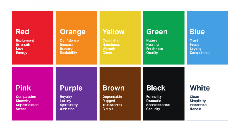
To perfect branding, you need to understand the psychology of color. For instance, if you use red as the primary color in your logo, then you send across emotions “excitement” and “passion”. However, if you use green instead, then you say “growth” and “fertility”. As you can see, by simply changing the primary color, you can change the impact of a brand.
In color psychology, perception is also sometimes because of evolutionary conditioning or cultural associations. For instance, most people associate the color blue with males and pink with females. In the same way, a red cross is used to denote medical care. Most of the famous brands of the world are aware of these connections and are careful to use appropriate colors in their own logos.
One thing to always keep in mind when studying colors for marketing purposes is the fact that there aren’t standard responses to different colors all the time. Borrowing the same example that’s shared above, the color red may generally say “excitement”. However, to some people, it can also raise associations with gore and violence. This again has to do with cultural and societal paradigms that are created and destroyed from time to time.
Choosing the Right Colors
Now that you understand that choosing the right colors is important for branding, you may want to know how you can choose the right colors. For that, you can take the following steps:
Research
Research definitely helps in finding the right colors for your brand. It mainly involves studying your competitors i.e. the colors that they are using in their logos and also keeping up with the latest trends so that you know how you can incorporate new color palettes into your designs.
60-30-10 Principle
Graphic designers often use the 60-30-10 principle when they work with colors. It’s a pretty simple rule and easy to follow too. It basically says that when you design a theme for a logo, banner, infographic, etc. then you use 60% of primary color, 30% of secondary color, and 10% of accent color.
Tools
There is a slew of online tools and apps that you can use to come up with interesting color schemes. For instance, Coolors is a simple online tool that gives you countless combinations of contemporary colors every time you hit a button. Similarly, Colormind is a fun tool that can generate color patterns for your inspiration. It can also generate a color palette from a photograph!
Conclusion
As you can see, colors play a critical role in logo design. If you are able to use the perfect combination of colors for your logo, then you can create a lasting psychological impact on your target audience to drive business. The good news is that there is a ton of resources on the Internet to study color psychology. Good luck!












Leave a Comment